Venn diagrams have an important place in my heart because the creator of the plots, John Venn, was from Hull, East Yorkshire (I grew up in the shadow of Hull). Hull gets a bad rap, but it gave the world the creator of the Venn diagram and the anti-slavery MP William Wilberforce; Hull ain't so bad, even if we speak a little funny.
I love Venn Diagrams, but they can be abused in two ways. First, is that you can have two (or more) overlapping circles, representing different sized sets, but the circles are the same size. Really, the circles should be proportional to the size of the list, and the overlapping area should also be proportional to the overlap of the data. This way, one can get an immediate impression of how high the overlap is, before noticing the numbers; this is especially important when the overlap is zero. This post will detail how to make a simple Venn in Python with a Venn package (matplotlib_venn).
The second way in which a Venn diagram can be abused will be the focus of a future post: This issue is when you try to make a Venn diagram from more than three samples. It is almost impossible to get the circles to be proportional to the set size. But there is an alternative approach (see future post).
This walkthrough was designed to be followed along in the Jupyter (IPython) notebook. For a guide on setting up and using the Jupyter notebook, please see this previous post (link). As always, the first box of the notebook should contain this to allow the plots to appear in the notebook:
$ %matplotlib inline
The rest of the code should work mostly as is in any other way you run Python. Then to make Venn diagrams with Python, make sure you have installed the package: matplotlib_venn (with pip, it would be pip install --user matplotlib-venn or sudo pip install matplotlib-venn).
To import matplotlib_venn and matplotlib, do the following in Python:
$ from matplotlib_venn import venn2, venn2_circles
$ from matplotlib_venn import venn3, venn3_circles
$ from matplotlib import pyplot as plt
Then read or make the list into python that you want to compare eg:
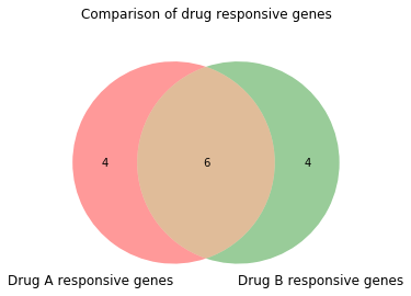
$ lst1 = ["gene1", "gene2", "gene3", "gene4", "gene5", "gene6", "gene7", "gene8", "gene9", "gene10"]
$ lst2 = ["gene0", "gene1", "gene2", "gene3", "gene8", "gene9", "gene10", "gene11", "gene12", "gene13"]
Now you can compare the two lists with the venn2 function of matplotlib_venn:
$ venn2([set(lst1), set(lst2)])

This function takes a list of sets as an argument ([set(lst1), set(lst2)]) to make the plot. Then we can label these groups with an appropriate name; this is done by setting set_labels equal to a tuple with the names of the samples in the same order as the list of lists. We can also add an extra line of code to give the plot a title.
$ venn2([set(lst1), set(lst2)], set_labels = ('Drug A responsive genes', 'Drug B responsive genes'))
$ plt.title('Comparison of drug responsive genes\n')
Now imagine if there is a third experiment you want to include in the comparison. Now you can do this with the venn3 function. First we will make a new list.
$ lst3 = ["gene0", "gene4", "gene5", "gene8", "gene9", "gene10", "gene11", "gene13", "gene14", "gene15", "gene16"]
Now we can call the function with all three lists:
$ venn3([set(lst1), set(lst2), set(lst3)], set_labels = ('Drug A responsive genes', 'Drug B responsive genes', 'Drug C responsive genes'))
$ plt.title('Comparison of drug responsive genes: The great update\n')

We can see some lovely overlaps. Looking at a different drug (drug D) rather than drug C we can:
$ lst4 = ["gene1", "gene4", "gene5", "gene14", "gene15", "gene17", "gene18", "gene19"]
$ venn3([set(lst1), set(lst2), set(lst4)], set_labels = ('Drug A responsive genes', 'Drug B responsive genes', 'Drug D responsive genes'))
$ plt.title('Comparison of drug responsive genes: Another great update\n')

This plot is brilliant because there is no overlap between the differential genes from treatment with drug B and D, and we can see this instantly. Some ways of making Venn diagrams will have a large physical overlap but with the number 0 in the middle. By using matplotlib_venn, you can show this instantly with by demonstrating that there is no overlap.
Finally, we can look at drug E.
$ lst5 = ["gene1", "gene4", "gene5", "gene14", "gene15", "gene17", "gene18", "gene19", "gene20", "gene21", "gene22", "gene23", "gene24", "gene25", "gene26", "gene27", "gene28", "gene29", "gene30", "gene31", "gene32", "gene33", "gene34", "gene35", "gene36", "gene37", "gene38", "gene39"]
$ venn3([set(lst1), set(lst2), set(lst5)], set_labels = ('Drug A responsive genes', 'Drug B responsive genes', 'Drug E responsive genes'))
$ plt.title('Comparison of drug responsive genes: The last great update\n')

Now we can see just how much of a difference in the number of differential genes change in the different responses. This is important to consider when thinking about the overlap and whether that is just due to chance. To see the Jupyter notebook used for this blog, download it from here.